
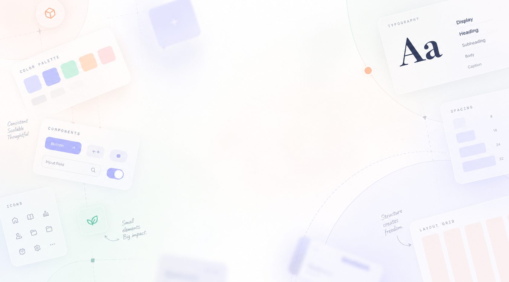
One source of truth for a family of products — and a way to stop AI tools inventing hex codes.
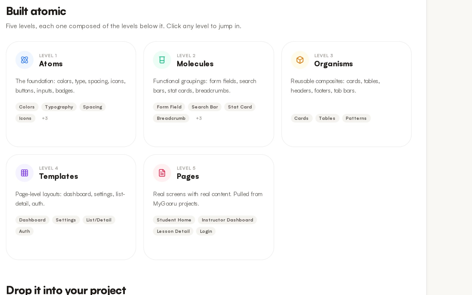
Tokens, components and patterns for nine products, published three ways: CSS variables for developers, a Figma library for designers, and a server that AI coding tools can ask.
- ROLE
- Design systems lead
- SCOPE
- Tokens · components · docs · MCP server
- STATUS
- v3 published · adoption still partial
Internal product work. I led and built this system inside MyGooru; the screens below are documentation pages I authored. Unreleased product surfaces, roadmap and commercial specifics are withheld, and the values shown are the published tokens rather than internal planning material.
Nine products, nine interpretations of the same brand.
Each product had drifted its own way. Persona colours had crept onto buttons. The same action looked different per app. Spacing had gone off-grid. There was no shared answer to “what is our card shadow”. Then AI coding tools arrived. Asked to build a screen, they invented plausible hex codes — close enough to look fine, wrong enough to never match.
A small set of decisions held still. Then made cheap to obey.
A small set of choices, held still. Then the same tokens published for every kind of consumer. Designers get a Figma library where responsiveness is a variable mode — not a duplicated frame. Developers get CSS variables. AI tools get a server that answers with real values instead of guessing.
Persona colour never touches a button
Student coral, instructor indigo and parent teal are for badges and surface tints only. Every button in every app stays one blue, so the primary action is recognisable wherever you meet it.
Responsive by variable mode, not by duplication
Three modes on the layout and type collections. Set a frame’s mode and everything inside re-sizes — same components, three layouts, no second set of screens to keep in sync.
Two variant axes, booleans for the rest
Variants carry only the fundamentals; icons, subtitles and chevrons are boolean properties. Keeps each component under thirty variants while still allowing thousands of configurations.
The same values, handed to designers, developers and AI tools — so none of them has to guess.
A design system fails at the point of consumption. If obeying it is more work than inventing a value, someone invents a value. So the tokens are published in the form each consumer already reaches for.
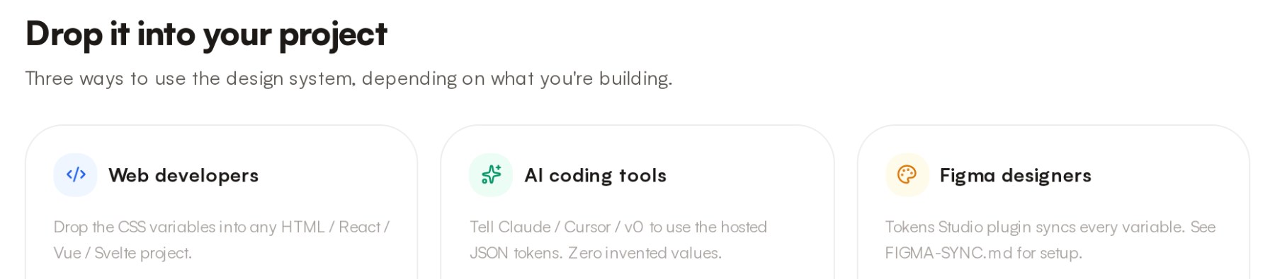
The third path is the one that did not exist a year ago and now matters most. Asked to build a screen, an AI coding tool will produce a hex code that is plausible — close enough to look right in review, wrong enough to never match the product it ships beside.
So the system runs a small server that answers with real values: token categories, a specific token’s value, the full spacing scale, the source of any component, and the design principles themselves. Eight tools and three resources. The instruction to a coding agent stops being “follow our design system” and becomes “ask it”.
A JSON file has to be found, pasted, and kept fresh in every context window. A tool call cannot go stale, and it fails loudly rather than silently returning last month’s blue.
Some decisions are locked, and each one records the argument that settled it.
A design system is only as useful as the number of questions it has stopped re-opening. Writing down the objection means the next person inherits the reasoning, not just the rule.
Warm Stone neutrals, never pure black
Text sits on a warm near-black and sections alternate on a cream, rather than the cool grey the default palette would give. An education product read as clinical in the cool set.
Cost — A custom neutral ramp to maintain instead of a framework default.
Pill buttons, not a 6px radius
Matched to the UI kit already in use rather than to the newer system. The existing shape was the one people recognised, and a system that renames what already works spends its credibility early.
Cost — The newer, squarer direction was dropped.
Strict 8px grid, including every responsive value
Spacing and radii are multiples of eight with four as the only half-step — and the mobile and tablet values are on-grid too, which is where systems usually leak a 14 or a 28.
Cost — Some optical adjustments cannot be made at the size they would want.
Hover lives in prototype reactions
Hover and press states are wired as prototype interactions with a 150ms smart animate, so a designer can feel the component in Figma rather than reading a state chart.
Cost — Wiring per component; two components are still unwired and that is recorded, not hidden.
The principles underneath are not mine, and the system says so on its own front page.

“Pick from the scale. Never invent.” is the whole system in six words, and it is also the reason the token server exists — it is the only way to make that sentence true for a consumer that cannot read a document.
I defined, built, and published the whole system. The token architecture. The Figma library. The React implementation. The server that makes all three agree.
- 01The token architecture: primitives, semantic aliases, and responsive layout and type modes
- 02The Figma library — collections, text and effect styles, components, and documentation pages
- 03The React implementation and the published CSS variable layer
- 04An MCP server exposing tokens, component source, and the design principles to AI tools
- 05Contribution rules, naming conventions, and the Figma-to-code sync workflow
The system’s value is that a value now has one place to live, and three ways to be read.
Counts below describe what the system contains, taken from the Figma library and the server manifest. Adoption across products was not instrumented, so no claim is made about how consistently it is followed — only that the shared source now exists and is cheap to obey.
- 159
- variables across four collections
- 55
- component variants from eleven components
- 8
- tools exposed to AI coding clients
Counted from the Figma library and the MCP server manifest. No adoption or consistency metric is claimed.
I built a design system that no product actually depended on.
Classroom was a byte-level fork of its CSS, Instructor had diverged onto its own blue, and Learner never adopted at all — tokens flowed from the apps into the system rather than out of it. I had treated the library as the deliverable. Adoption was, and it is counted in dependencies.
Goloka
Building the digital commerce platform for a heritage fragrance brand: a live Shopify store, and the custom, dealer and multi-brand platform after it.