All work

04 · HEALTH AI · PRODUCT & UX LEAD

CURRENT

A personalised resilience companion for people living with cancer, designed for the time between appointments.
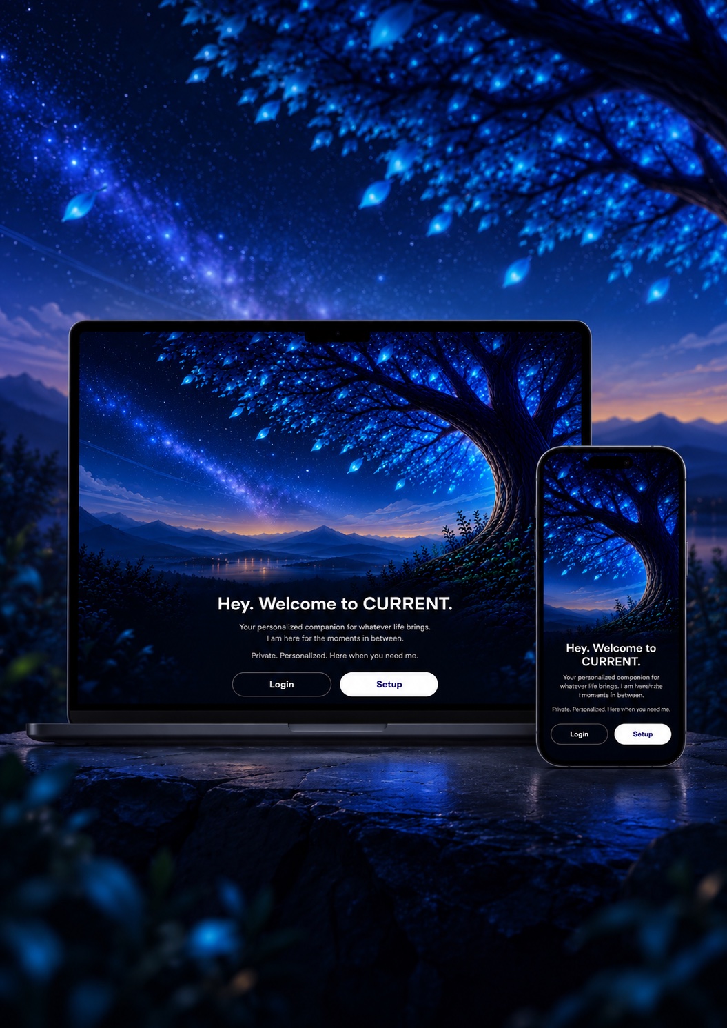
CURRENT on a laptop and a phone, both on the welcome screen — a glowing blue tree over a night landscape, “Hey. Welcome to CURRENT.”, and Login and Setup buttons — set on a stone ledge under the same starry tree.
Contents · 6 chapters
01

The brief

The brief was still moving

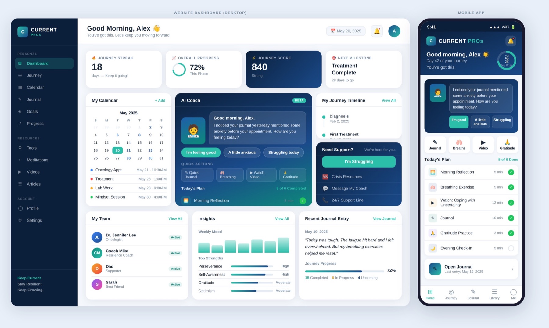
The client brought an AI-generated dashboard and an MVP document. They pointed in different directions: the dashboard used streaks, progress, scores and strengths ratings; the MVP said the product should not be gamified.

I used the MVP as the stronger constraint. Those elements did not make it into the product. Missing a few days should not feel like failure.

The early font also felt wrong, so I pushed back and moved the interface to Satoshi for a calmer, more readable starting point.
streakprogressscore
The client's AI-generated reference dashboard: tiles for Journey Streak (18 days, keep it going), Overall Progress (72%) and Journey Score (840, strong), above a calendar, an AI coach panel and a strengths chart.

fig. 01 — Client reference. Useful as a reference, not a product direction.

  • Not in the MVP
  • Missed days should not feel like failure
  • Support, not performance
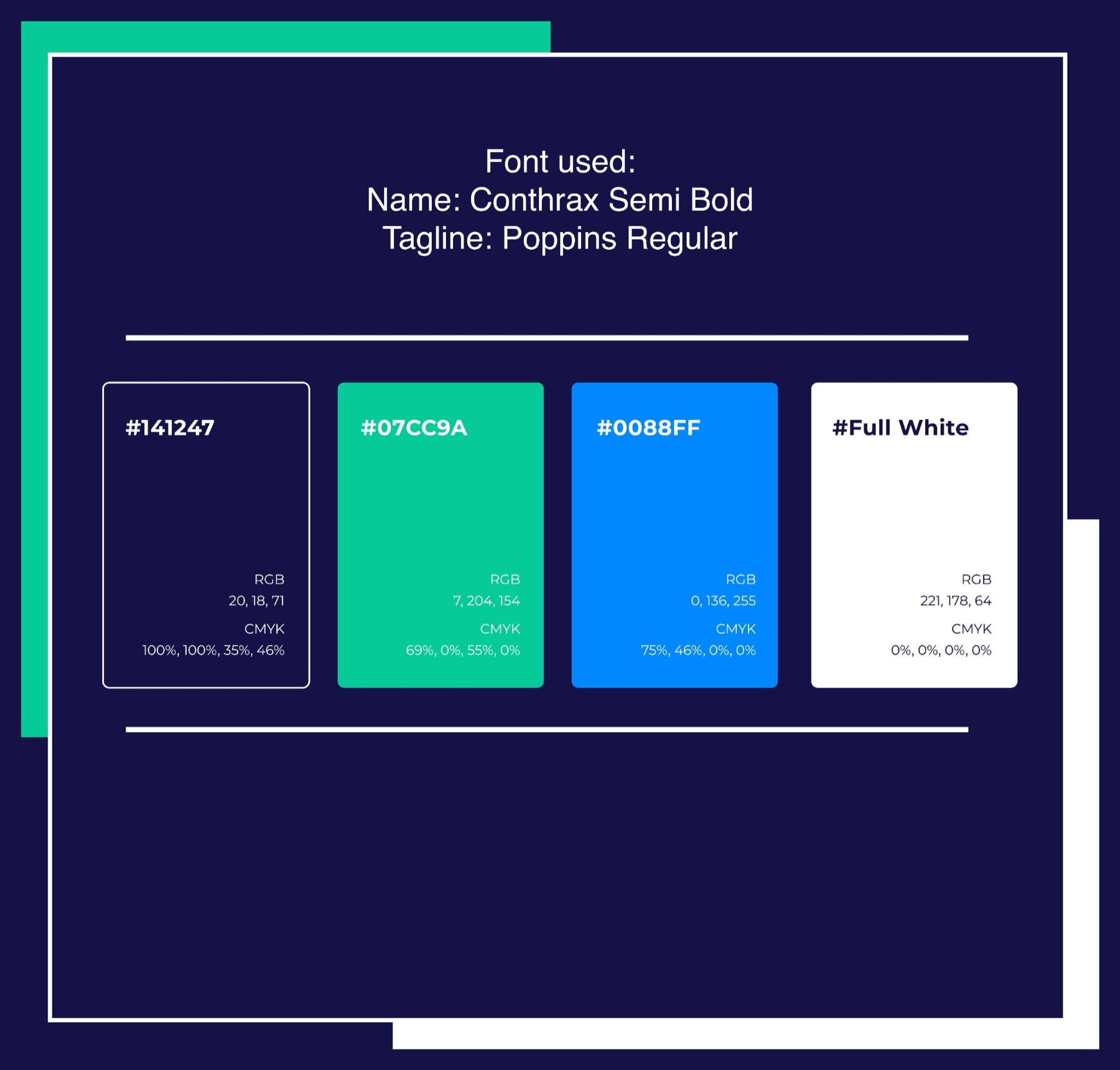
The original branding board: the wordmark set in Conthrax Semi Bold with a Poppins tagline, and swatches of deep navy, mint green, bright blue and white.
too much like an experiment
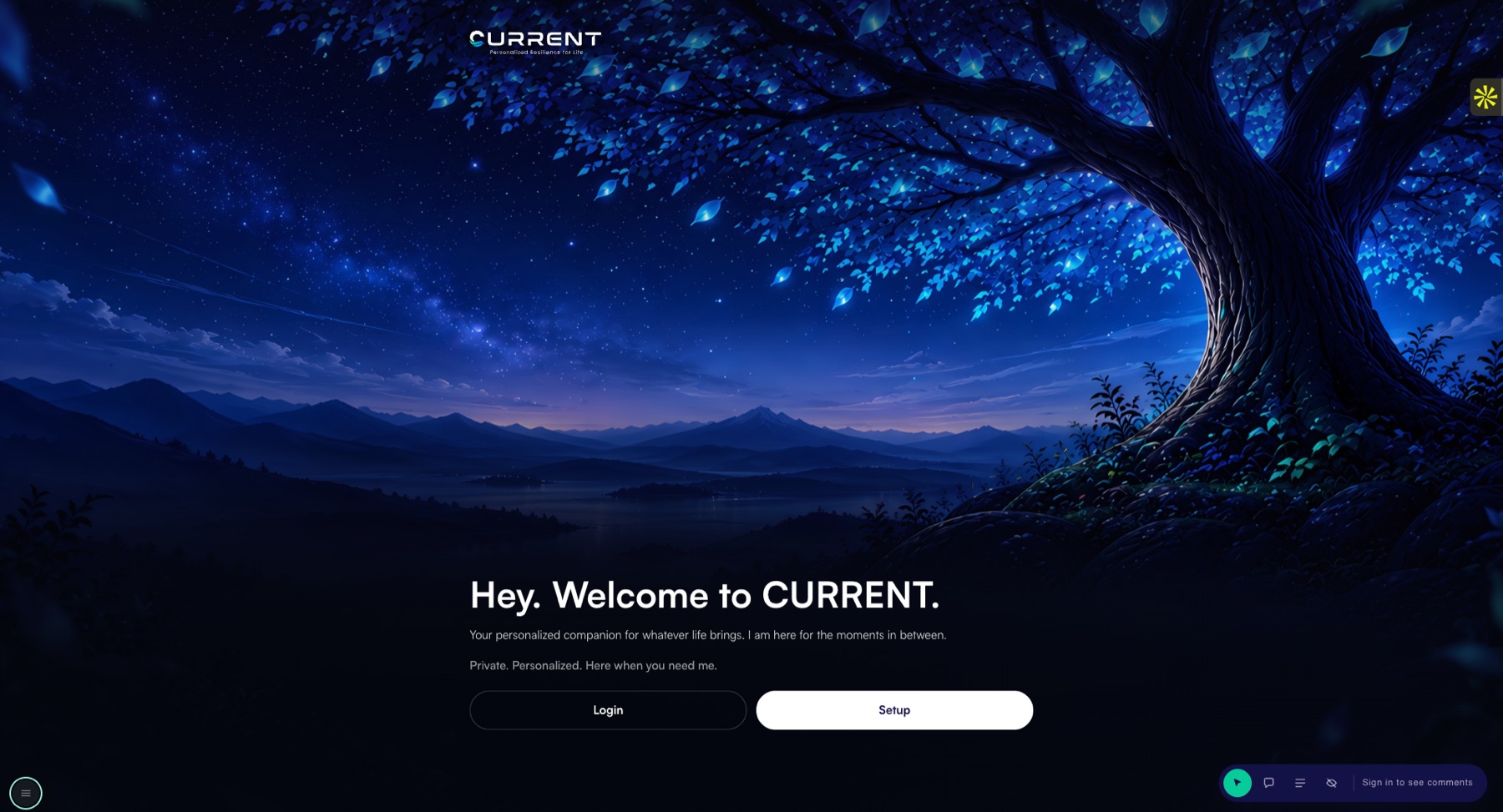
The final CURRENT welcome screen: a glowing blue tree over a night landscape, the line “Hey. Welcome to CURRENT.” in Satoshi, and Login and Setup buttons.
more space, calmer type, clearer return point
ROLE
Product & UX lead
SCOPE
Product direction · onboarding · role-based experiences · health AI UX · safety states · prototype
STATUS
Functional prototype
TIMELINE
July–August 2026
Under NDA

Client work under NDA. Names shown in the screens are demo data.

02

People & structure

The people and the system

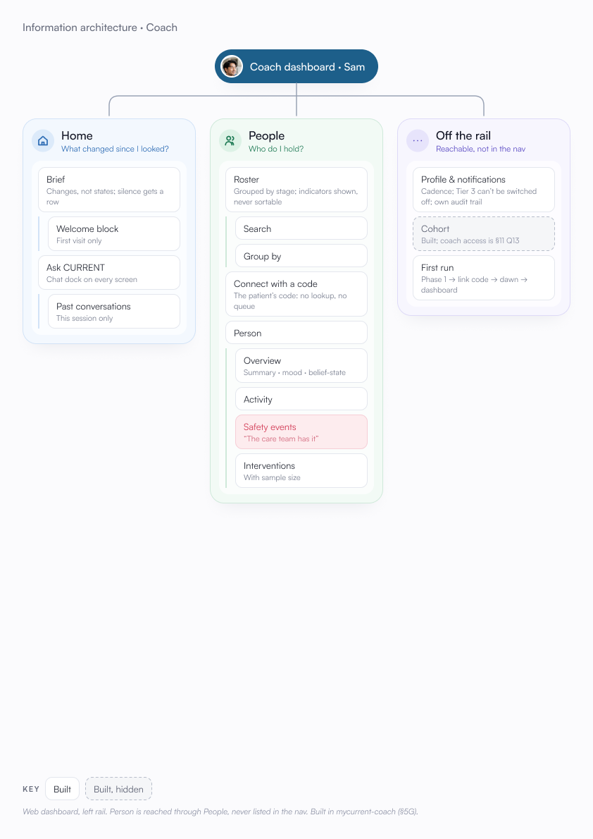
CURRENT had four roles: patient, caregiver, coach and clinician.

These were working assumptions based on the MVP, seeded data and review notes, not research findings.

Personas and information architecture helped define what each role needed to do, what they could see and where the system needed to hand off.

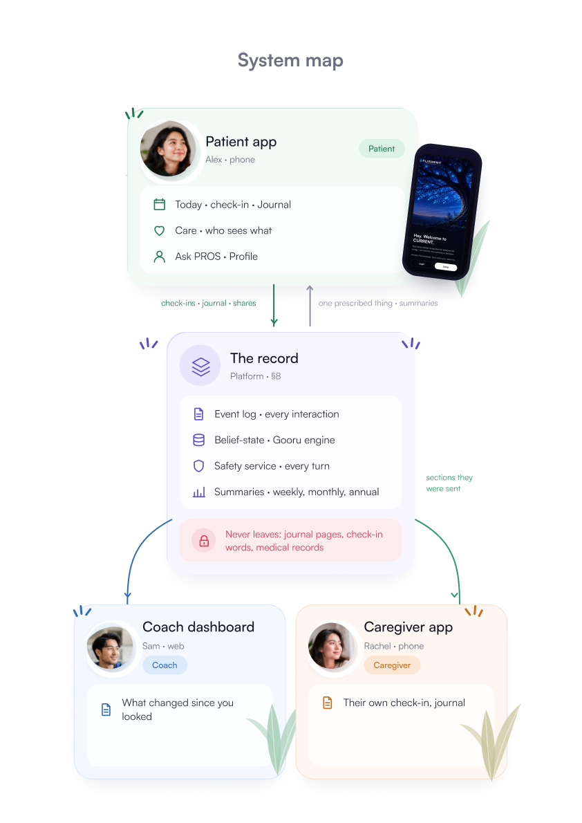
This was not one app with permissions added later. The roles shaped the structure from the beginning.
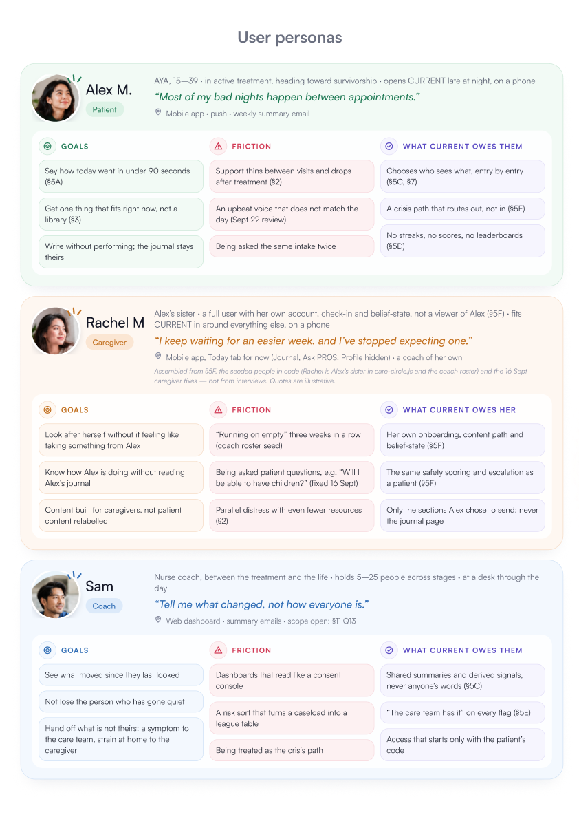
User personas: Alex M., the patient; Rachel M., the caregiver; and Sam, the coach — each with goals, friction and what CURRENT owes them.

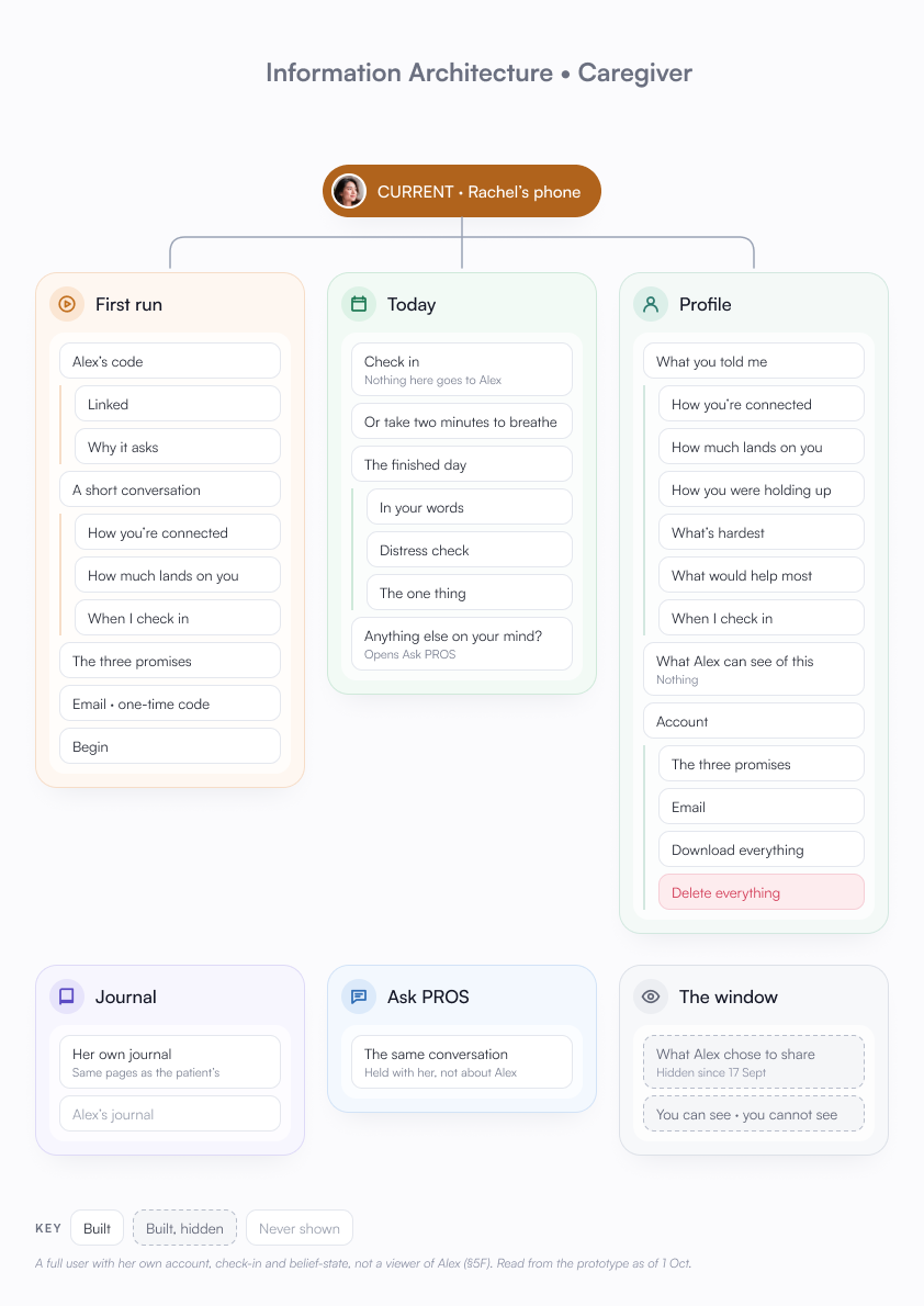
System map: the patient app, the record underneath, the coach dashboard and the caregiver app.

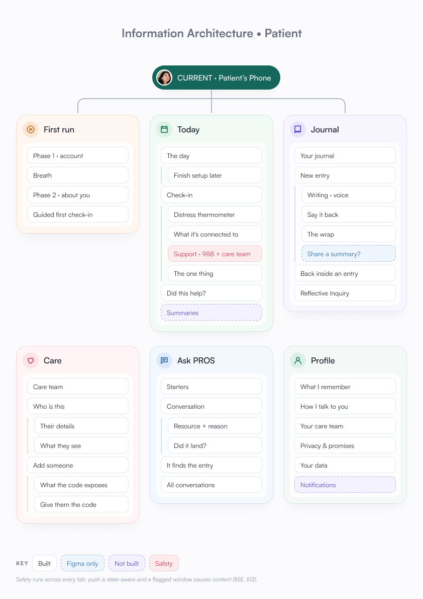
Information architecture of the patient app.

03

Onboarding & journeys

Onboarding and difficult moments

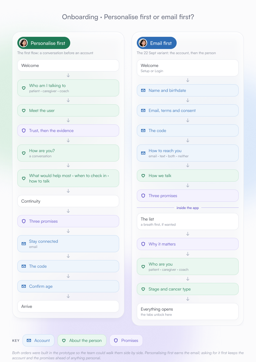
Onboarding took the longest because the team was still deciding what to ask first: account details, personalisation or how someone was feeling.

I explored a split layout and a chat direction before settling on a mixed flow: quick selections when possible, open responses when context mattered.

Journey maps helped identify the moments where the product needed to be careful: the first weeks, a bad night, scan week, someone going quiet or a serious flag.

The split-screen onboarding: an illustrated shield on a night path on the left, and on the right the first question, “First, what should I call you?”, with a single name field.
The mobile welcome screen: the glowing tree, “Hey. Welcome to CURRENT.”, and Login and Setup buttons.
split layout

visual mood without turning the question into decoration

chat directionexplored in Figma

more conversational, but question order mattered more

mixed flow

select when quick; write when context matters

The patient's journey map across six stages, from diagnosis and invite to after treatment, lowest on a bad night.The coach's journey line across six stages, lowest when a flag appears.

04

Flows & safety

Flows, personalisation and safety

I mapped the patient, coach and clinician flows, including their exits.

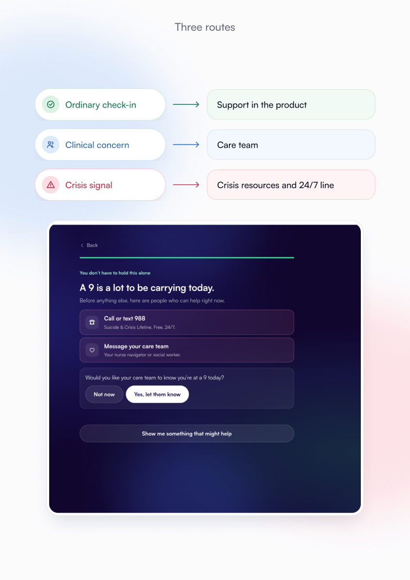
A check-in could continue in the product, move to the care team or route to crisis support.

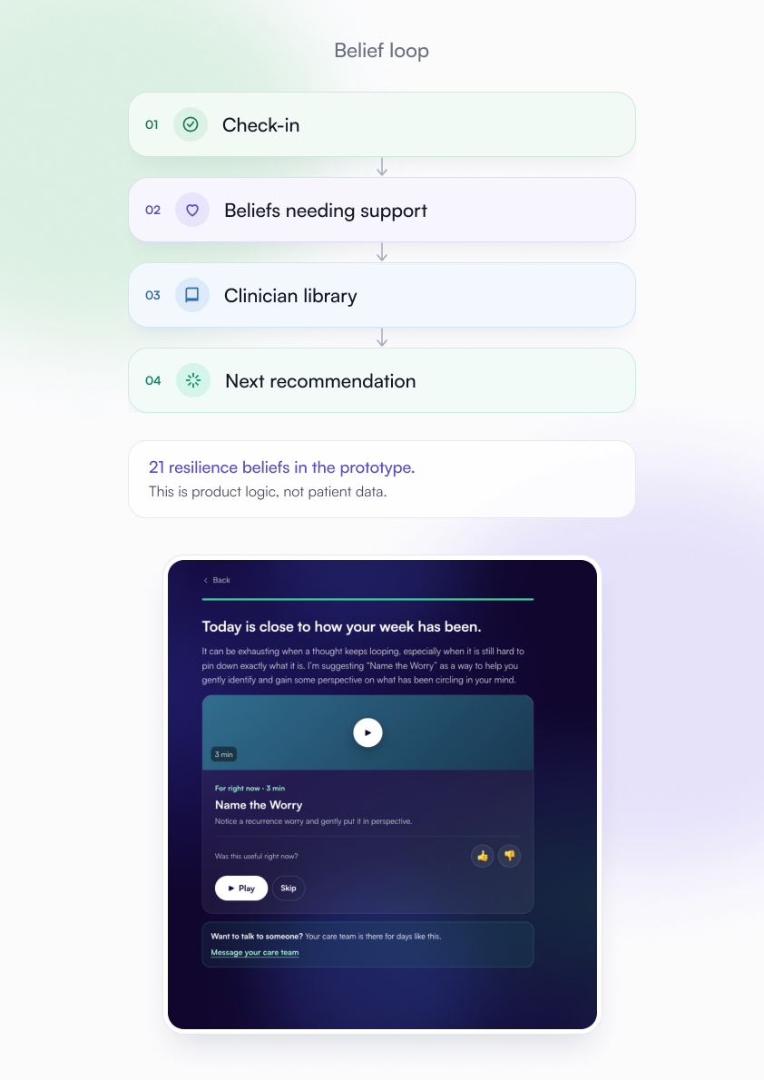
Behind the interface, the belief system updates after each interaction and uses clinician-created content to shape later responses.

I designed the visible check-in, recommendation and handoff states. The belief engine, classifiers and clinical operations were outside my scope.
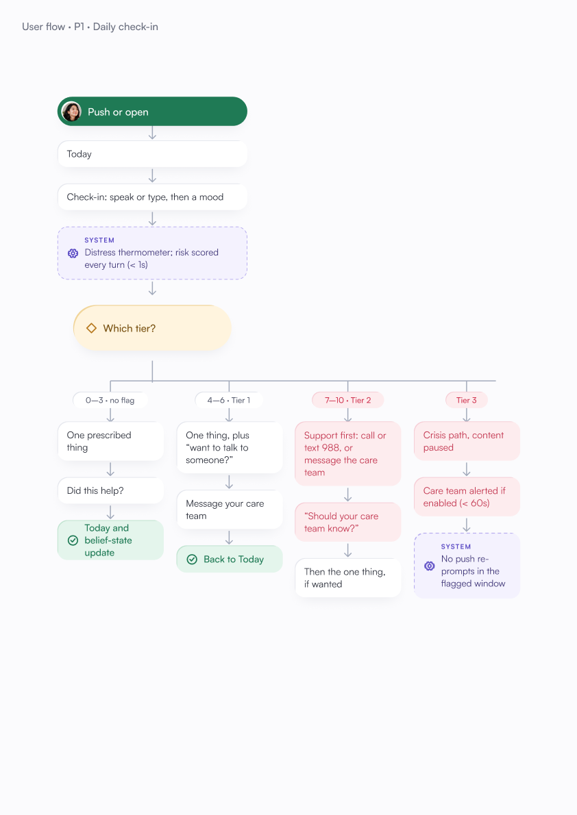
Patient flow P1, daily check-in.

Coach flow C2, daily review and hand-off.

Coach flow C3, a flag appears: the care team is told first.

01Check-in
02beliefs needing support
03clinician library
04next recommendation
21 resilience beliefs in the prototype. This is product logic, not patient data.
A recommendation screen: “Today is close to how your week has been.” It suggests a three-minute activity called “Name the Worry”, with Play, Skip, a was-this-useful rating, and a link to message the care team.

The everyday support screen: a suggested three-minute “Name the Worry” activity, with a link to message the care team.
The crisis-support screen: “A 9 is a lot to be carrying today.” Before anything else it shows a 24/7 crisis line and a way to message the care team, asks whether to let the care team know, and only then offers something that might help.
  • ordinary check-insupport in the product
  • clinical concerncare team
  • crisis signalcrisis resources and 24/7 line

05

Privacy

Privacy and shared information

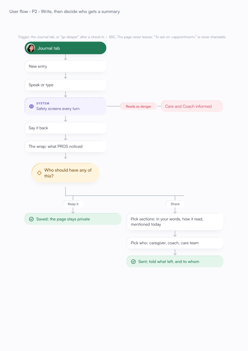
Journal pages and check-in words stay private.

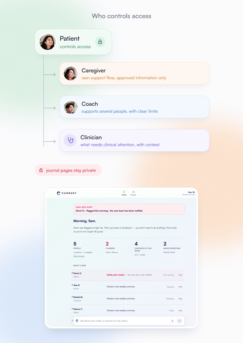
Caregivers, coaches and clinicians receive different levels of information based on role and permission.

The patient decides what can be shared before someone is invited.

This became a minimum-disclosure approach: show each person what they need without turning private experience into a shared dashboard.
The coach home: a high-risk alert saying the care team has been notified, counts of people, flagged, checked in and mood dropping, and a list of recent updates from patients and a caregiver. All names are demo data.
Patientcontrols access
Caregiverown support flow, approved information only
Coachsupports several people, with clear limits
Clinicianwhat needs clinical attention, with context
journal pages stay private

Who sees what: what the patient writes, chooses to share and what the platform derives, against patient, caregiver, coach and clinician.

Patient flow P2, write, then decide who gets a summary.

Patient flow P3, bring a coach in: the code belongs to the patient.

The service blueprint: one check-in followed from the patient's screen through the platform, the coach and the care team.

06

Prototype

From Figma to React

I moved into Claude Code because of the deadline, but the layouts became repetitive while the flow was still changing.

I returned to Figma to settle the decisions, then rebuilt the direction in React.

The prototype was shared through GitHub with the full-stack developers, AI engineer, CTO and product manager.

It brings together seven connected support flows, 21 resilience beliefs and three safety and escalation tiers.

The product is in beta. There are no health-outcome or clinical-impact results to claim yet.
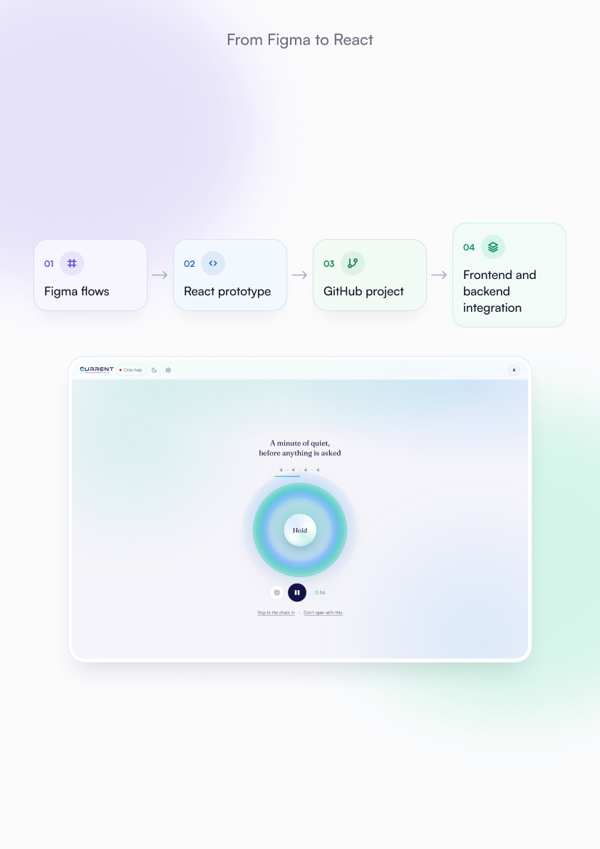
01Figma flows
02React prototype
03GitHub project
04frontend and backend integration
The CURRENT patient home: a breathing exercise with the headline “A minute of quiet, before anything is asked”.

The open-questions inventory: ten decisions, in the order they unblock work.

Next — 05

MyGooru Design System

Built the token, component and documentation layer every product in the family draws from — including a server so AI tools stop inventing values.

OPEN TO SENIOR AND LEAD ROLES

Hiring a senior product designer or a design lead?

I'm also open to product work that needs a direction and a working prototype from the same person. Email is the fastest way; I usually reply the same day.

[email protected] ↗

BENGALURU, INDIA · IST (UTC+5:30)