
A timer you can’t forget is running.
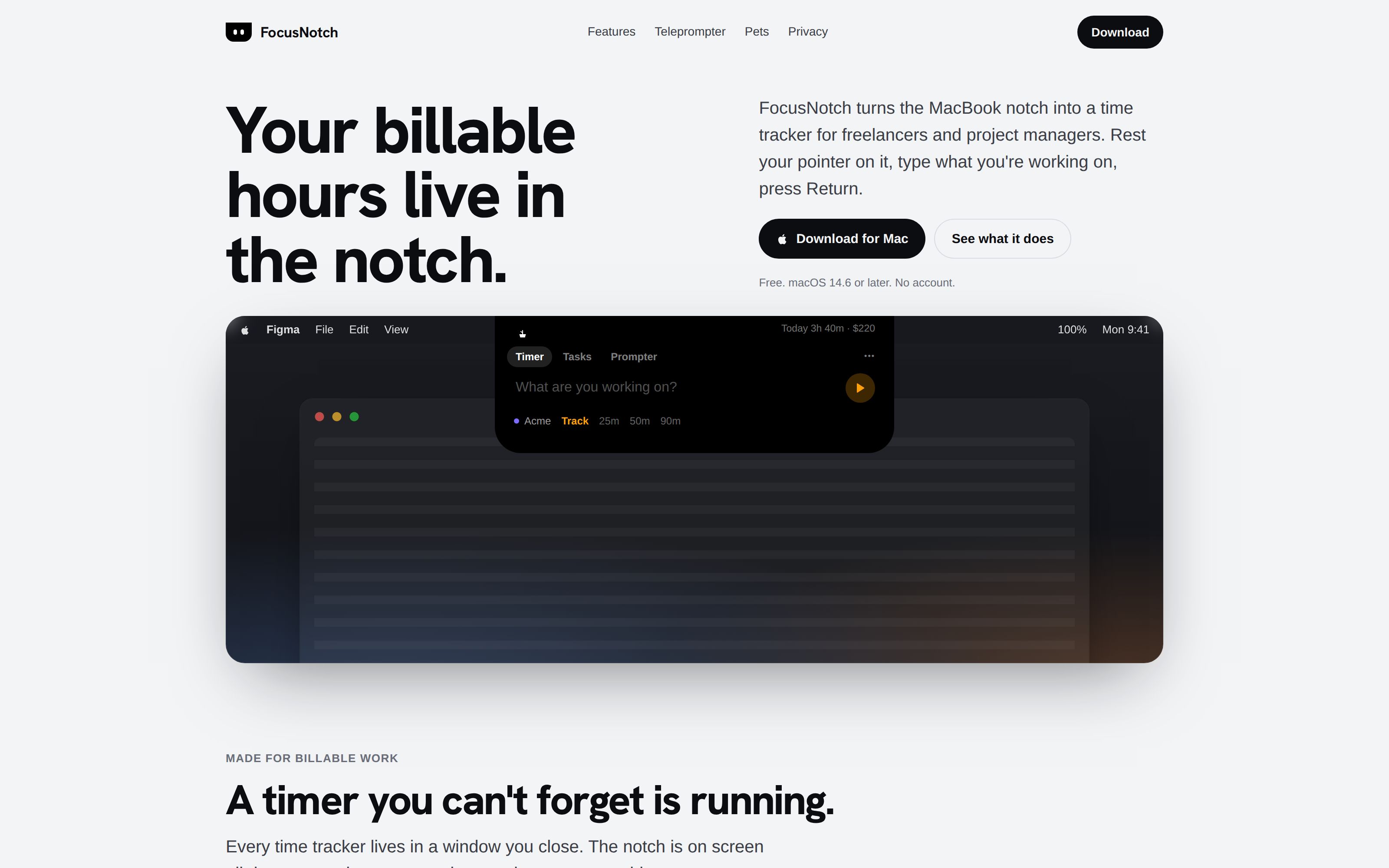
A time tracker for freelancers and project managers, built into the MacBook notch. The clock stays where you already look, and everything that would interrupt you arrives through the same black shape.
Contents · 14 chapters
A time tracker in the MacBook notch, and a home for everything that interrupts you.
FocusNotch is a Mac app for freelancers and project managers who bill by the hour. The timer lives in the notch next to the camera. So do the things that usually break your concentration from the corners of the screen: volume and battery pop-ups, notifications, music and meetings. A small character keeps it company.
I designed it and built it in SwiftUI and AppKit, including the parts that talk to macOS below the public APIs.
- ROLE
- Design, engineering, site
- SCOPE
- SwiftUI · AppKit · React site
- PRICE
- Free, no account
- STATUS
- Early access, version 1.2 — free download
What it does, with a notch at the top of the page you can hover and try.
The timer that loses you money is the one you can’t see.
Freelancers bill from their timers, so a timer’s mistakes cost money. Every time tracker lives in a window, and windows get closed, covered and forgotten.
- Forgot to start itThe hour is never billed.
- Forgot to stop itThe invoice is inflated, and someone has to notice.
- Started it on the wrong projectThe hour goes to the wrong client.
The top of the screen has the opposite problem. macOS drops its volume pop-up, its notification banners and its meeting alerts into the corners, each in its own style, away from where you are looking. The one part of the screen that nothing covers, the notch, does nothing at all.
One place at the top of the screen, speaking one language.
The notch holds the clock. Anything else that needs your attention comes out of the same black shape: it widens for a volume change, drops down for a message, and folds back when it is done. Rest the pointer on it and it opens into a panel for the timer, tasks, calendar, music and meeting notes.
The timesheet, invoices and projects need room, so they live in a separate manager window. The notch only has to answer small questions quickly.
If it looks like part of the Mac, people stop noticing it’s an app.
The first panels were a purple card with borders and a glow, then a row of pill-shaped fields. Both read as a website pinned to the screen. The notch is hardware, so the panel copies the hardware: pure black, no borders or cards, one tint for the clock, and corners that flare into the menu bar with the same 10 pt curve the notch has.
Scale was the second correction. Bigger versions read as “not Apple” beside the menu bar. Alcove, the notch app most people know, is small and dense, so its numbers became the brief: a 460 pt panel, 16 pt text in the field, 12 pt for everything secondary, 34 pt buttons.
Dynamic Island over macOS’s Liquid Glass. The notch is already black hardware; the panel should look like more of it, not like a window laid over it.
Less of the motion and form is distinctly mine. People who use notch apps have already learned how one should feel, and I followed that.
A start that takes two seconds.
If starting the timer takes effort, people skip it. So it starts from the keyboard: ⌃⌥Space, type what you’re working on, press Return. A session with no project goes into “General”, which is created on first use, instead of a greyed-out Start button on a fresh install.
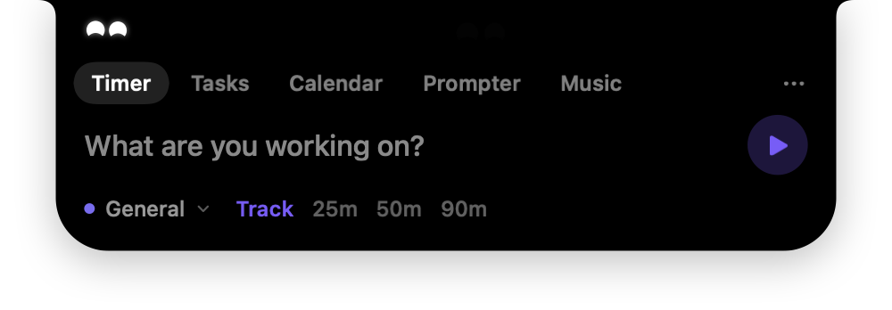
Start first and file later. A session with no project is still a correct record of time, and it can be moved to a client in the timesheet.
Some hours land in General and need filing later.
Nothing under the camera, and a ring that only measures what’s real.
While a session runs, the notch grows two wings, the character inside a ring on the left and the time on the right. Their width is measured from the physical notch, so nothing is ever printed behind the lens.
A progress ring needs a denominator, and a plain tracking session doesn’t have one. So the ring fills only against something real: a Pomodoro’s length, or a project’s agreed hours. Against a budget it turns amber at 80% and red past 100%, before the invoice says so.
The wings started at 64 pt a side. On an app with a long menu, Figma for one, they covered the last menu titles. They are 48 pt now.
With no target, the ring stays a quiet full circle. It is there, but it doesn’t pretend to measure anything.
The ring means different things in different sessions, so it has to be learned.
The notch sits under every trip to the menu bar. It can’t open every time.
Anything at the top of the screen gets brushed past all day. A panel that opened on contact would open dozens of times an hour by accident, so the notch asks for intent in small steps.
- Acknowledge, then openIt swells 3.5% when the pointer arrives and opens only if the pointer rests. Passing over it costs nothing.
- Swipe down to open at onceA two-finger swipe skips the wait.
- Controls hold it shutHovering the stop or play button keeps the panel closed, so it never opens out from under your click.
- Typing holds it openWhile you type a task or a meeting note, a drifting pointer doesn’t close the panel and lose the text.
Make opening a deliberate act, with the hover swell as proof it was noticed.
A deliberate open is a beat slower than it could be.
macOS already interrupts from the top. The notch does it in one voice.
Pressing a volume key showed macOS’s banner in the top-right corner. The notch now takes the key, sets the volume itself and widens by a few points: a glyph on one side, a level bar on the other. When it closes, the glyph fades first and the black folds back into the camera housing, the reverse of how it opened. Brightness and charging use the same wings.
Notifications drop out of the notch instead of sliding in from the corner. The first version read them from macOS’s notification database, which took about ten seconds to update, so the system banner always came first. Now the notch reads each banner through Accessibility the moment it appears, shows it, and closes the original. I timed the hand-off at about 90 milliseconds.
Web apps needed their own reading. A WhatsApp Web message arrives from Arc with “WhatsApp:” as its title and the sender underneath, so the first alerts showed “WhatsApp:” and no name. The notch now recognises common messaging sites and shows the person, the message, and the site’s name.
Replace the system surfaces rather than add to them. Two indicators for one volume press is worse than either.
It needs Accessibility and Full Disk Access, and it relies on how macOS draws banners today, which Apple can change in any update.
Whatever is playing, even in a browser tab, with a record that turns.
While music plays and no timer is running, the notch widens with the album art on the left, cut into a disc that turns while it plays and stops where it is on pause. The right side has play and pause, beside the character bobbing to the music. A running timer keeps the wings; the timer is the product.
Since macOS 15.4, Apple answers “what’s playing?” only for its own signed programs, so FocusNotch saw nothing even with YouTube playing. A small helper now runs inside the system’s own Perl, which Apple still answers, and streams the track to the app.

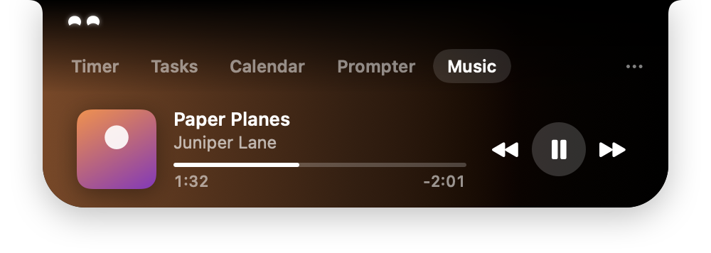
The player was rejected twice before it looked like this.
- First pass: circled buttons, a purple progress bar, 9 pt monospaced times. It read as a web player.
- Second: the iPhone’s expanded Now Playing, cleaner but tall. “Not that big.”
- Now: one row, the artwork’s own colour washing in from the left, and play in a glass circle. The strip beside the camera stays black.
- Clicking the art or the title brings forward the exact tab or app that is playing.
Route through Perl, the way Alcove and Boring Notch do, rather than show music only for Music and Spotify.
It depends on a gap Apple could close, and the helper is one more thing that can fail.
Join from the notch, and take notes where you’re already looking.
A meeting alert says when, for how long, and offers the two things you do next: Join, when the invite holds a Zoom, Meet or Teams link, and Notes. A new invitation says who sent it and opens it in Calendar.


Invented meeting and invite, rendered from the app.
Notes belong to one occurrence, so a weekly stand-up gets a fresh page each week. They copy out as Markdown for a doc or a ticket.
Keep notes in FocusNotch and never write them into the calendar event. An event’s notes sync to everyone on the invite.
Notes don’t follow the meeting to your phone. And Apple gives apps no way to accept or decline an invite, so replying still happens in Calendar.
A face with no mouth, and a personality with a word limit.
The notch had a character from the start. Early ones were too much: a tomato, then an outlined face. Two white eyes lasted longest. The current one, Visor, is modelled on EMO, the desk robot: two soft, glowing rounded squares that say everything with their shape. Lids slide down, tilt into a frown or droop when it’s tired, and the bottoms curve up into a smile. Every expression morphs into the next rather than cutting.
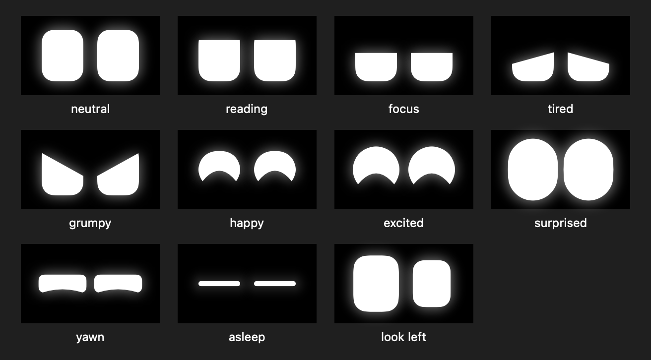
- It pays attentionThe eyes follow the pointer, and the eye nearer the pointer grows while the other shrinks. It dozes when you’ve been away and wakes with a hop when you come back.
- It reactsWide eyes at a notification, a flinch at loud volume, a hop when the charger goes in or a task gets done, a frown as a project nears its budget.
- It has a daySleepy late at night, grumpy once a budget is blown, cheerful after three finished pieces of work. The mood changes its face and its idle habits: yawns, sneezes, a double-take.
- It talks, rarelyA greeting by name when you come back, “2 hours in. Stretch?”, “Over budget on Acme”. One line every ten minutes at most, twelve a day, each said once.
Ration the talking. A pet that speaks too often becomes one more notification, which is the thing the notch exists to calm down.
Most days it says two or three things. People who want a chattier companion won’t get one.
It reads your notifications, so none of it can leave.
A time tracker sees your whole working day. This one now also reads your notifications and holds your meeting notes. There is no account, and none of that leaves the Mac. Hours, clients, rates and notes are files on it. Your preferences can sync through iCloud, but only if you turn that on.
The app is free. It once planned a $19.99 Pro tier; the licensing code was removed rather than switched off, 626 lines. Version 1.2 added the one exception: once a day it sends a random install ID and the version number, so I can count users and number the first 50 as founding users. It can be turned off, and the server stores no IP address.
Count people, never what they do. The one thing that leaves the Mac is a random ID that says nothing about who you are or how you work.
No usage data to learn from, and a count that anyone could inflate with made-up IDs.
Free to download, and too new to measure.
I did all of it: the idea, the interaction and visual design, the native build, and the helper that talks to macOS. FocusNotch runs on my Mac and the flows on this page work in it, though invitations and web-app messages have so far been tried only with test data. Version 1.0 went up as a free download on 28 September 2026. It is signed but not notarized by Apple, so the first launch has to be allowed in System Settings. It is too new to have usage figures.
- ~90 ms
- from a macOS banner appearing to the notch showing it
- 5,166
- lines removed folding four manager layouts into one
- 0
- servers your hours, notifications or notes are sent to
The timing comes from the app’s own debug log, the line count from the project’s commit history. There are no usage figures yet, and no revenue because the app is free.
When something feels wrong, measure it before redesigning it.
Most of what went wrong this time was invisible from the design. Music was missing because macOS stopped answering. Notifications were late because a database lagged by ten seconds. Permissions vanished because each build was signed differently and macOS no longer recognised the app. None of these would have been fixed by a better layout.
“There is a delay” turned out to be a 90 ms pipeline behind a 220 ms window animation. I timed it before changing anything, and the fix was the animation. I measure first now, then design.
MyGooru
Designing across a connected learning ecosystem: Learner, Instructor, Mentor, Library and the design system under them.